RetroStart is a worldwide portal dedicated to vintage design. If you've never checked out their site, I think you'll be thrilled to find instant access to so much top-notch mid-century information in one place.

Monday, February 28, 2011
Thanks to RetroStart
My sincere thanks go to Margaret at RetroStart for letting me know last night that they have included Mid2Mod in their list of design blogs with posts about vintage mid-century modern design. I'm extremely honored and pleased to be listed alongside so many outstanding sites and resources.
For the love of mid-century
Do you ever look at your pageviews by country and marvel that on any given day there might be people in Romania or Latvia looking at your blog...or that last month you had 123 pageviews from Russia, 63 from Brazil and 78 from the Philippines? It's cool to know that the love of mid-century modern design truly is universal.
I remember thinking when I started posting that it might be like giving a party and nobody coming. Then a bunch of you nice people started dropping by every day and leaving comments, and I was encouraged to keep writing. It's likewise encouraging to see how many people around the world are reading, even if they aren't leaving comments. (But, please, DO leave comments...I love to read them!)
Maybe it doesn't seem so amazing to those of you a lot younger than I am. You grew up with computers, so being globally connected seems normal to you. But some of us grew up in a time when the most interaction you could have with someone in another country was if your teacher got snail mail "pen pals" for the class...and that seemed very exotic! I know...it sounds very "Our Miss Brooks," but that's really how it was when I was in school in the 50s.
So to you 3 people from Romania...keep coming back! I appreciate all my readers.
 |
| Eve Arden as English teacher Connie Brooks otrcat.com |
(We're heading out of state on a buying trip, so I probably won't have a chance to respond to any comments today. We're looking for sofas and upholstered chairs. Wish us luck!)
Sunday, February 27, 2011
Magical mystery score
A few weeks ago, my SIL picked up a pewter tea set and a couple of vases on an online auction. Thanks to an existing sticker, the green piece was quickly identifed as an Orrefors squeeze vase designed by Lena Bergstrom almost 15 years ago. Since it's newer than anything we collect, it will go into the store, where we will primarily sell mid-century furniture, with just a sprinkling of newer items that complement that style. I discovered that the vase normally retails for around $200. We'll price considerably less, so someone will get a good buy on it. The tea set and the other vase remain a mystery.
The bottom of the brown vase isn't marked and any sticker is long gone, so I will probably only identify it by pure chance when I'm researching something else. It looks similar in some ways to the work of several Scandinavian glassmakers, but so far I haven't found an exact match.
The tea set is stamped, but the writing is so small that it's impossible to tell if it says "Magness" or "Hagness." A search turned up pewter pieces under both spellings, so apparently I'm not the only one who's having trouble telling if that tiny stamped letter is an M or an H. I found the identical cream and sugar set on an American site listed as Hagness and selling for $60. On a Scandinavian site, I found pewter listed as Magness, but it had the traditional floral rosemaling, not the geometric design. All I know for sure is that the set was made in Norway.
I searched the Internet for a couple of hours this weekend, and I couldn't turn up information about a company of either name, so for now I've hit a brick wall. If you know anything about the manufacturer or designer of this set, I'd appreciate the information. I could use any help you could offer identifying the brown vase too.
 |
| "Magness" or "Hagness" pewter tea set from Norway |
 |
| Brown mystery vase and its green Orrefors companion |
 |
| Thank goodness for the occasional sticker that makes identification easy! |
Saturday, February 26, 2011
For the birds
Toikka was trained in ceramics but has designed textiles for Marimekko and has worked as a stage and costume designer as well. Toikka has described his work by saying, ”Baroque is exactly the right word to describe my work – after all, one of the word’s original meanings is an irregular pearl."
The birds range in size from the tiny Puffballs that measure 2 3/4" x 2" and sell in the $100 range to the massive pieces that measure over a foot in length, like the Festive Pheasant that measures in at 9 3/4" x 15" and sells for well over $1000.
I saw one of the birds on eBay a couple of days ago at $5.99, but the price immediately soared to $152.50, which is still considered a low price. One of these days I'll find one tucked away at an antique mall or thrift store for $10, and I'll scoop it up. Hundreds of dollars is more than I'm willing to pay.
 |
| Green ibis, 6 1/2" x 8 1/4" artatheart.co.uk |
 |
| Barnacle goose, 8 1/2" x 14" museumofglassstore.org |
 |
| Bullfinch, 4 1/8" x 3" counterpointhome.com |
 |
| Common male teal, 4" x 6 1/2" irenesfavoritethings.com |
 |
| Small loon, 9 1/2" x 6 1/2" upnorthsundries.com |
 |
| Eagle, 11" x 10 3/4" stylendesign.co.uk |
 |
| Puffballs, 2 3/4" x 2" museumofglassstore.org |
 |
| Oiva Toikka with Festive Pheasant, 9 3/4" x 15" go.nbm.org |
Friday, February 25, 2011
New door fever
 |
| My existing blah door, redeemed only by cool hardware |
After seeing pictures of my transformed house, getting a new door moved up several notches on my To Do list. These are just a few of the possibilities if I replaced my door with one from Crestview Doors:
 |
| Carlysle in Mocha |
 |
| Street view of Carlysle in Mocha |
 |
| Langston in Rose |
 |
| Street view of Langston in Rose |
 |
| Dupont in Black |
 |
| Street view of Dupont in Black |
 |
| Allandale in Pumpkin |
 |
| Street view of Allandale in Pumpkin |
 |
| Throckmorton in Mocha |
 |
| Street view of Throckmorton in Mocha |
It was helpful seeing the orange and rose doors, because I was considering painting, but now I think I need a more subdued color like the mocha or black with my wood blinds. I like the style of the Throckmorton, because my house was built in 1950 and doesn't look as wildly mid-century as some of the other houses in my neighborhood built in the late 50s. The Throckmorton seems to bridge the post-war ranch with later styles.
I also have to consider the multi-paned floor-to-ceiling windows across the front of my house. The Throckmorton seems subtle enough not to compete with the windows for prominence. Some of the styles I tried gave the front of the house the appearance of being too "busy."
Finally, I like the Throckmorton from a security standpoint. I live in a large urban area, and while my neighborhood is very safe, break-ins aren't unknown, and the glass is high enough not to be near the deadbolt. I love the Carlysle, and I think the Langston in mocha would look great too, but I'm a little concerned about the glass placement. What do you think?
Thursday, February 24, 2011
According to a Manufacturer: Is it real?
Last week I posted about the first article in a three-part series on the Jet Set Modern website. The second contributor to the article "Is It Real?" is William F. Berg of Modern Wood Works in Kenner, Louisiana. His company manufactures a line of shelving based on the design of Eames shelving units. (First post: According to a Collector)
Berg clarifies the laws concerning inventions and designs, explaining two types patents:
- Utility patents - Protect inventors for 20 years. Charles Eames received a utility patent in 1942 for "A Method of Laminating Articles," which included the curved plywood chair.
- Design patents - Keeps a designer from being copied for 14 years. Eames received one of these in 1948 for the LCW (Lounge Chair Wood).
Once these patents expire, they can not be renewed. At that point, it is entirely legal for any manufacturer to use the design and put his own label on the resulting product.
Trademarks, which include words, names or logos that identify a product, can be renewed. For example, Knoll, Inc. has exclusive rights to the word Knoll when applied to furniture. Knoll also has the rights to the term Barcelona. Once the patent on a design expires and it enters the public domain, anyone can manufacture the item but cannot call it by its trademark name. Hence, all the inventive names given to Barcelona chair look-alikes, such as "The Pamplona," which is a regular in Craigslist ads.
Berg answers the accusation that manufacturing or buying a reproduction is unethical or immoral by pointing out that most Americans feel fine about buying generic drugs. Most have made copies on machines that were not made by Xerox, and most have talked on telephones not tied by pedigree to Alexander Graham Bell. Looking at it that way, maybe we are cherry-picking our causes about which to be righteously indignant.
Berg considers the terms knock-off, reproduction and re-issue (both "authorized" and "unauthorized") to be little more than sales ploys to discredit legitimate competitors who are operating completely within the scope of patent and trademark laws. He says that if a company is honest, makes a good product true to the original design that meets your needs and makes it at a fair price, buy it. He also reminds the reader that the original goal of the modern design movement was to make well-designed products affordable to the masses.
So...can you tell these apart without looking a my sources? One is a vintage Eames CSU, one is by Matt Blatt, and one is by Vitra.
 |
| The "authorized" version, 2011 vitra.com |
 |
| Replica by Matt Blatt mattblatt.com.au |
 |
| The vintage Eames piece treadwaygallery.com |
Update: 4-19-2014 - The article that was originally on the Jet Set Modern site has been deleted, so I have removed the dead links from this post.
Wednesday, February 23, 2011
Landscaping for mid-century homes
One of the most popular posts on this blog is about authentic mid-century houseplants, which continues to receive hundreds of views each week. Because so many readers find it helpful, I decided it's time to post suggestions from real estate and landscape professionals for making your mid-century home beautifully authentic on the outside. Every Wednesday for the next three weeks, I'll be posting about specific choices of shrubs and trees, perennials and groundcovers. Even if you don't have a yard, many of the plants can be grown in pots on a patio or beside a front door, so there should be something for everyone.
Since California is the birthplace of the mid-century home, who better to get advice from about landscaping first than a California real estate company that knows all about authentic MCM curb appeal? Renee Adelmann has created a real estate site that not only lists homes for sale but also gives homeowners tips on landscaping, paint colors, and remodeling.
She has the following tips for authentic mid-century modern landscaping:
- Allow the geometry of the home to guide the overall design of the landscape & garden
- Select water-wise plants that maintain their foliage year-round
- Allow hardscape elements to carry from the front yard to the back (including the atrium)
- Repeat the use of certain plants throughout the landscape
- Consider a water feature
- Mix materials to create variety with textures (rock, grass, wood, metal, crushed stone)
From eichlerforsale.com
 |
| eichlerforsale.com |
 |
| eichlerforsale.com |
 |
| eichlerforsale.com |
 |
| eichlerforsale.com |
 |
| eichlerforsale.com |
 |
| eichlerforsale.com |
 |
| pdxsuzanne.com |
 |
| houzz.com |
 |
| georgeandeileen.com |
 |
| seattledreamhomes.com |
 |
| carcinc.com |
 |
| strelldesign.com |
Tuesday, February 22, 2011
Juice tumblers?
Who knew? When I first saw these Frankoma brown satin pieces, I thought they were demitasse cups and a coffee pot. I guess that's a pretty common error, because when I started to do my due diligence on them, several dealers had them listed that way too. I was having a problem figuring out why the "coffee pot" didn't have an indentation for a lid, but now it makes sense. It's a juice pitcher.
I'm still not sure whether these are Plainsman or Lazybones pieces, because I've seen them listed both ways. If you're a Frankoma expert, I'd appreciate more information about them. Whatever they are, I really like them, and I have a feeling someone will come into the store and like them too...whether they use them for juice or coffee.
When we picked these up, we were also able to get a small bowl and pitcher set, as well as what looks like a platter to me but is listed as a pie baker. As you can see, I have a lot to learn about Frankoma.
I'm still not sure whether these are Plainsman or Lazybones pieces, because I've seen them listed both ways. If you're a Frankoma expert, I'd appreciate more information about them. Whatever they are, I really like them, and I have a feeling someone will come into the store and like them too...whether they use them for juice or coffee.
 |
| #260 juice pitcher and six #260C juice tumblers |
 |
| #40A pitcher and #40B bowl |
 |
| #91 large baking dish or pie baker |
Monday, February 21, 2011
Pssst...It's called the Wyzenbeek rating.
Early-20th-century inventor Andrew Wyzenbeek devised a method to test fabric strength. He invented a machine that tests how many double rubs (considered one complete motion back and forth) a swatch of fabric can withstand before tearing. The rating should be on the fabric's label.
For residential use, 15,000-20,000 double rubs is usually an adequate Wyzenbeek durability rating. For heavier use, such as an office chair gets, 40,000 double rubs is usually required. An extremely high rating of 100,000 would be necessary for a textile receiving constant use by many people, such as in a theater or a school.
As you can see below, most good quality upholstery-weight fabrics in mid-century patterns have a durability rating that far exceeds requirements for normal home use. Before you buy bargain fabric, however, be sure to check the tag or bolt, or ask a store employee what the Wyzenbeek rating is, in order to be sure it suits your purpose.
From findarticles.com and encompassarch.com
 |
| Checker Split by Alexander Girard - 51,000 double rubs maharam.com |
 |
| Design 9297 by Josef Hoffmann - 23,000 double rubs maharam.com |
 |
| Dot Pattern by Charles and Ray Eames - 63,000 double rubs maharam.com |
 |
| Geometri by Verner Panton - 42,000 double rubs |
 |
| Pavement by George Nelson - 40,000 double rubs maharam.com |
 |
| Vases by Hella Jongerius - 100,000 double rubsmaharam.com |
Sunday, February 20, 2011
Ester, can I do laundry at your house?
Another blogger challenged us to show our mid-century laundry rooms, and I don't have one to share. I have a short hall separating my kitchen from my dining room, and it has the HVAC/water heater closet and pantry on one side and two separate laundry closets on the other side...one for the washer and one for the dryer. I toy from time to time with the idea of taking the wall down between them and turning the space into a really colorful and cheerful laundry alcove, but that's still down at the bottom of my To Do list.
Instead, I live vicariously through my friend Ester, who has one of the brightest, happiest laundry rooms of anyone I know. I've always loved her bold, confident use of color and pattern. So many of you enjoyed seeing other rooms in her house a few weeks ago that I thought I'd share more photos with you. I might not mind laundry day so much if I had a place like this to make me smile:
Photos courtesy Ester Jowett


If you look closely enough, you'll see vintage clocks and a mobile tucked among the more utilitarian objects. Did you spot them? Did you find anything else? I might have missed something.
Saturday, February 19, 2011
Where's the remote?
I was seven years old when my parents bought our first television set. The year was 1956, and the set was a huge blonde Zenith. I'll never forget the excitement I felt when the deliveryman rolled that behemoth into the living room.
They kept that TV till they bought their first color set sometime in the late 60s or early 70s. I was a newlywed at the time, and we were still using hand-me-down items to decorate our home, so the Zenith made its way to our apartment. Of course, blonde wood was totally passé at the time, so I availed myself of the same remedy everyone else was using on old furniture. I "antiqued" it...olive green.
Not only that, I gutted it, put a shelf in it, put doors on it...and covered the doors with some hideous-beyond-belief flocked Con-Tact paper in a Spanish scroll design...more olive green, but with gold flecks as an added (albeit even more gaudy) bonus. I hung a huge conquistador picture above it and called it our bar. As ugly as the thing was, it saw many a good time roll back in the day.
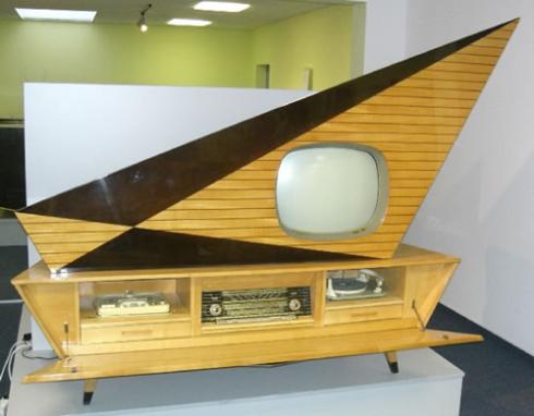
Here is one more TV I found on another site that I had to include in this post. This is a futuristic German entertainment unit from 1958. How wild is this thing? It looks like it's about to blast off.
They kept that TV till they bought their first color set sometime in the late 60s or early 70s. I was a newlywed at the time, and we were still using hand-me-down items to decorate our home, so the Zenith made its way to our apartment. Of course, blonde wood was totally passé at the time, so I availed myself of the same remedy everyone else was using on old furniture. I "antiqued" it...olive green.
Not only that, I gutted it, put a shelf in it, put doors on it...and covered the doors with some hideous-beyond-belief flocked Con-Tact paper in a Spanish scroll design...more olive green, but with gold flecks as an added (albeit even more gaudy) bonus. I hung a huge conquistador picture above it and called it our bar. As ugly as the thing was, it saw many a good time roll back in the day.
 |
| 1956 Zemotj flickriver.com (Roadsidepictures) |
Here is one more TV I found on another site that I had to include in this post. This is a futuristic German entertainment unit from 1958. How wild is this thing? It looks like it's about to blast off.
 |
| gadgethim.com |
Subscribe to:
Posts (Atom)